Choosing the Right Color Palette
Color is a powerful element in design and decoration, capable of transforming a space and evoking emotions. Selecting the right color palette for your home is crucial, and it requires a balance between aesthetics and functionality. This blog post will guide you through the process of picking and implementing a color scheme that will enhance the ambience and personality of your living spaces. From drawing inspiration from existing patterns to adhering to design principles like decorating from dark to light, you’ll discover valuable tips for making informed choices about color. Dive into your next decorating project equipped with these insights, and create a harmonious environment that reflects your personal style.
Pick a Color, Any Color
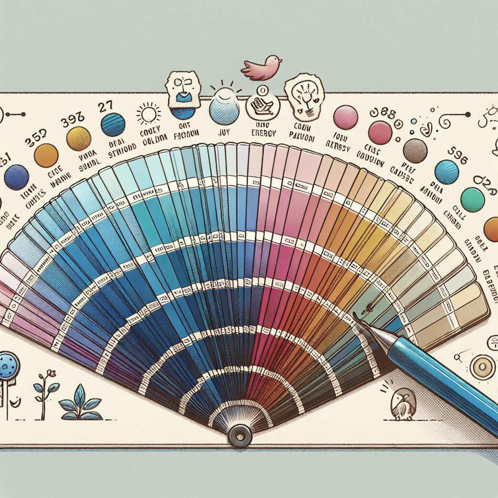
Choosing a color palette can often feel overwhelming due to the seemingly endless options available. However, this process should be seen as an exciting opportunity to inject personality and mood into a room. Start by considering what emotions or atmosphere you want the space to convey. Warm colors like reds and oranges can create a lively and energetic environment, while cool colors like blues and greens tend to produce a calming effect.
One effective method is to select a favorite color as a basis and build the palette around it. This choice can become your ‘hero’ shade, which is central to the design of the room. You can then add complementary or contrasting hues to add depth and dimension. Remember, there’s no wrong choice, but it’s essential to ensure that the colors you select resonate with the purpose of the space and your aesthetic preferences.
Choose a Color Scheme From the Largest Pattern in the Space
A useful strategy for determining a color scheme is to draw inspiration from the largest pattern in the room. This could be a rug, piece of artwork, or even a wallpaper design that already adds visual interest. By identifying key colors from this pattern, you lay the groundwork for a cohesive and well-integrated color palette.
The largest pattern establishes a visual anchor that other elements can revolve around. For instance, if a piece of art features multiple earthy tones, you might introduce browns and greens into the furniture and accent pieces. This ensures a seamless flow and coherence in how each visual component interacts within the space.
It’s also important to consider the texture and design dynamics of patterns, as these attributes can influence how colors are perceived and experienced. It may be useful to test colors by bringing samples or swatches home to gauge how they react to natural and artificial light throughout the day.
Decorate From Dark to Light, Vertically
One classic decorating principle is the concept of ‘from dark to light, vertically.’ This design approach suggests working with darker shades at the foundation, medium tones at eye-level, and lighter hues above. The rationale behind this is rooted in nature, where the ground is typically darker such as soil, moving up to the lighter sky.
This technique enables a natural transition that feels intuitive to the eye, enhancing the perception of space and harmony. For example, a room might feature dark wooden floors, mid-tone walls, and a light ceiling. This not only grounds the space but also creates an uplifting environment that feels open and welcoming.
Implementing this method allows you to use color in a way that enhances architectural features and highlights various room elements. It’s a versatile guideline that adapts well to different styles and preferences, helping achieve balance and proportionality effortlessly.
Start With the Formal Areas of the House
Begin your color journey by focusing on the formal areas of your home, such as the living room, dining room, or entryway. These spaces often set the tone for the rest of the home, providing a canvas upon which you can apply your chosen color scheme as a guiding thread throughout the entire house.
The color scheme of formal areas often incorporates more sophisticated or statement shades, which can seamlessly transition into adjacent rooms or spaces. This approach fosters a sense of continuity, preventing the design from being compartmentalized or disjointed from room to room.
By establishing a color narrative in these areas first, you can ensure that the broader vision of the home’s color design is clear and consistent. A thoughtful selection in your formal spaces can serve as the anchor or reference point for designing more personal and intimate areas like bedrooms and private studies.
Future Prospects: Harnessing the Power of Color
In conclusion, selecting an effective color palette requires a thoughtful approach to create harmony and an emotional connection within your space. By exploring your initial reactions to colors, drawing from existing patterns, adhering to natural transitions, and prioritizing formal areas, you can turn your home into a canvas that is both functional and visually engaging. Continue to experiment and allow yourself to be guided by your instincts and the ever-evolving trends in interior design, and watch your space transform into a unique reflection of your personality and style.
| Guideline | Description |
|---|---|
| Pick a Color, Any Color | Select a central color based on mood and personal preference, then build around it with complementary hues. |
| Choose a Color Scheme From the Largest Pattern | Use existing patterns in the space as a reference point to ensure visual cohesion and flow. |
| Decorate From Dark to Light, Vertically | Implement a gradient strategy from dark to light to create balance and highlight architectural features. |
| Start With the Formal Areas | Anchor your color scheme in formal areas to establish a cohesive color narrative across your home. |