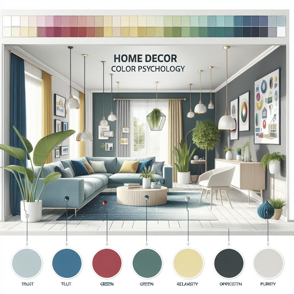
Home Decor Color Psychology
Color is not merely an aesthetic choice but a powerful tool in interior design that can profoundly influence mood and ambiance. Understanding color psychology can help create harmonious living spaces tailored to individual preferences and needs. This blog post delves into the fascinating world of color psychology, exploring how different colors impact our emotions and how these insights can be strategically used in home decor. From the invigorating energy of red to the calming effect of blue, discover the significance of each color and their roles in crafting your desired atmosphere. Join us as we navigate the colorful spectrum that can transform your home into a sanctuary reflecting your unique personality and lifestyle.
Psychology of Colors for Interior Design
The discipline of color psychology studies how colors impact human behavior and emotions. In the realm of interior design, this concept takes on practical importance, guiding designers to select palettes that evoke specific feelings. The appropriate use of color can shape a space’s energy, turning a house into a home. While personal preferences play a role, understanding general color responses is crucial in creating universally appealing environments.
Interior designers leverage color psychology to enhance or moderate a room’s function. A calming palette may suit a bedroom, promoting restful sleep, while a dynamic scheme can energize a workspace. Color choices also consider cultural associations and personal memories, adding layers of meaning to the design strategy. Overall, understanding the psychology of colors equips homeowners and designers alike to make informed decisions that enhance the quality of life.
What is Color Psychology?
Color psychology explores the impact of hues on our mood, behavior, and decision-making. This field examines how different shades can evoke a range of emotions, from tranquility to excitement. In marketing and branding, these insights are used to influence consumer behavior. In the context of home design, color psychology aids in crafting environments that align with desired emotional outcomes.
This psychological science considers various elements, such as lightness, saturation, and cultural perceptions. Colors carry different meanings across societies; for instance, while red may symbolize luck in some cultures, it could signify danger in others. Therefore, understanding these nuances is fundamental to applying color psychology effectively in home decor, ensuring that spaces are both aesthetically pleasing and emotionally resonant.
How Does Color Psychology Affect Interior Design?
Incorporating color psychology in interior design offers more than just aesthetics – it helps in aligning spaces with their intended purposes. Different rooms necessitate different emotional ambiances, and color psychology provides a roadmap to achieving this alignment. By recognizing the emotional ties to colors, designers can craft environments that motivate productivity, encourage relaxation, or foster social interaction.
For example, a living room may benefit from warm hues that invite conversation and camaraderie, while a study might utilize cool tones to encourage focus and concentration. Additionally, designers often use color contrasts to define spaces, especially in open-plan layouts. Ultimately, the right color scheme can enhance both functionality and comfort, making color psychology an integral part of successful interior design.
Role of Different Colors
Red
Red is a color of passion, energy, and excitement. It has the power to stimulate the senses and increase adrenaline, making it a popular choice for spaces meant to evoke vibrancy. When used in living rooms or dining areas, red can foster a lively atmosphere conducive to social gatherings. However, its intensity can also be overwhelming if overused, so balance is key.
In bedroom design, red should be used sparingly, perhaps as an accent color, to avoid disrupting relaxation. Different shades of red, from bold crimsons to soft burgundies, can evoke varying degrees of warmth and drama, allowing for nuanced expressions within a space.
Brown
Brown provides a reassuring and stable presence in interior design, often associated with security and comfort. Derived from natural elements, it introduces warmth and an organic feel to any space. Brown can be harmoniously paired with various colors, enhancing the texture and depth of a room.
Utilizing brown in furniture and flooring creates a grounded atmosphere, often used in spaces intended for relaxation or casual interaction. However, too much brown can lead to a dreary environment, so pairing it with other colors can balance and uplift the overall mood.
Orange
Orange is often associated with enthusiasm, creativity, and warmth. It combines the energy of red and the happiness of yellow, creating a balance that can both invigorate and comfort. In home decor, orange can be the perfect choice for informal dining areas or playrooms where social activities and lively interactions take place.
For spaces needing a vibrant touch without overwhelming energy, softer hues like peach or terracotta might be utilized. These shades introduce a calming effect, making them suitable for living spaces aiming to blend warmth with relaxation.
Yellow
Yellow signifies optimism, cheerfulness, and sunshine. It is known to stimulate intellectual activity, making it an excellent choice for kitchens and offices. A yellow accent wall can brighten spaces, imparting a sense of joy and dynamism.
However, as a dominant color, yellow may lead to feelings of agitation if overused. Pair it with neutral tones or use it in more subdued shades to balance its bright disposition. Lighter yellows can work effectively in nurseries or sunrooms, enhancing light and creating a welcoming environment.
Green
Green is the color of nature and tranquility, symbolizing balance, renewal, and growth. It is known for its calming properties and is reminiscent of the natural world, making it an ideal choice for bedrooms and lounges where a serene atmosphere is desired.
In spaces where a fresh feel is wanted, such as bathrooms or kitchens, green can infuse a sense of cleanliness and vitality. Its versatility allows it to complement both modern and traditional design elements, providing a bridge between aesthetics and emotional balance.
Blue
Blue is often associated with tranquility and peace, making it particularly effective in spaces meant for rest and reflection, such as bedrooms and bathrooms. Its calming effect can reduce stress and promote relaxation, setting a peaceful tone in the home.
Darker shades, like navy, add sophistication and are often used in studies or libraries to inspire focus and contemplation. When mixed with lighter tones, blue can expand a room visually, evoking the openness of the sky or ocean.
Purple
Purple brings luxury and creativity to a space. Historically associated with royalty and wealth, it can add an element of sophistication and elegance to any room. Purple’s association with creativity makes it a popular choice for artistic zones or personal retreats.
While deep purples can create a rich, dramatic ambiance, lighter shades like lavender or lilac offer a more relaxed, romantic touch. Using purple as an accent or in patterns can introduce a touch of intrigue and depth to living spaces without overwhelming the senses.
Pink
Often linked to femininity and love, pink offers a gentle energy that can soothe and comfort. Soft pinks are frequently used in bedrooms and nurseries, creating a nurturing environment. When combined with other pastels, pink can form a delicate and harmonious palette.
Bolder shades like fuchsia are energizing and can add vibrancy in moderation, such as in an accent wall or decor items. Pink’s versatility allows it to blend in varied scenarios, from classic to contemporary settings, offering a fresh and playful touch.
Black
Black denotes sophistication and modernity, often used to anchor a room’s design. While it can make a striking impact, excessive use of black may evoke heaviness or even negativity. As such, it is often used as an accent or balanced with lighter colors to enhance its effect.
In minimalistic interior designs, black contrasts create structural clarity and elegance. It pairs well with metallic hues for a contemporary or industrial look, imparting a sense of boldness and confidence in the space.
Gray
Gray represents neutrality and sophistication, an ideal canvas for versatile interior design. It strikes a balance between white and black, adapting to different styles and themes effortlessly. Gray can soothe and calm, making it an ideal backdrop for living rooms or bedrooms.
Incorporating varying shades of gray adds depth and interest without overwhelming the senses. Its neutrality also allows pops of color through furniture and decor, offering endless possibilities for personalization while maintaining an elegant foundation.
White
Symbolizing purity and cleanliness, white is frequently used to maximize space and reflect light, promoting a sense of openness. It’s a staple in contemporary and minimalist designs, lending an air of sophistication and simplicity.
While white can enhance natural lighting and make rooms appear larger, overly stark environments might feel cold or sterile. Pairing white with warm tones or natural textures can introduce comfort and approachability, creating a serene yet inviting atmosphere.
Lessons Learned
| Color | Psychological Impact | Ideal Use Areas |
|---|---|---|
| Red | Energy, Passion | Living Rooms, Dining Areas |
| Brown | Comfort, Stability | Family Rooms, Lounges |
| Orange | Creativity, Warmth | Dining Areas, Playrooms |
| Yellow | Optimism, Stimulating | Kitchens, Offices |
| Green | Tranquility, Renewal | Bedrooms, Bathrooms |
| Blue | Calmness, Peace | Bedrooms, Bathrooms |
| Purple | Luxury, Creativity | Artistic Spaces, Retreats |
| Pink | Femininity, Nurturing | Bedrooms, Nurseries |
| Black | Sophistication, Modernity | Accent Usage, Minimalist Designs |
| Gray | Neutrality, Balance | Living Rooms, Bedrooms |
| White | Purity, Cleanliness | Minimalist Spaces, Open Areas |